
As the cliché goes, a picture says a thousand words. So, why not, after the effort we put forth in collecting our data, do we not capitalize on visuals when analyzing? How much more impactful can a visual dashboard be when portraying your datasets? In the final piece in our Marketing Data Integration series, let’s explore the power of visualization….
Take a look at the two graphics below. The first is a chart indicating a gender split in a random survey. The second is a custom graphic depicting the same statistics.
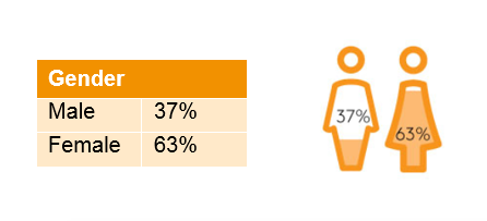
Which is more visually appealing? Which allows you to absorb the information faster? Research shows visuals work in collecting data, but also unveiled visualized information is said to be twice as shareable as non-visualized.
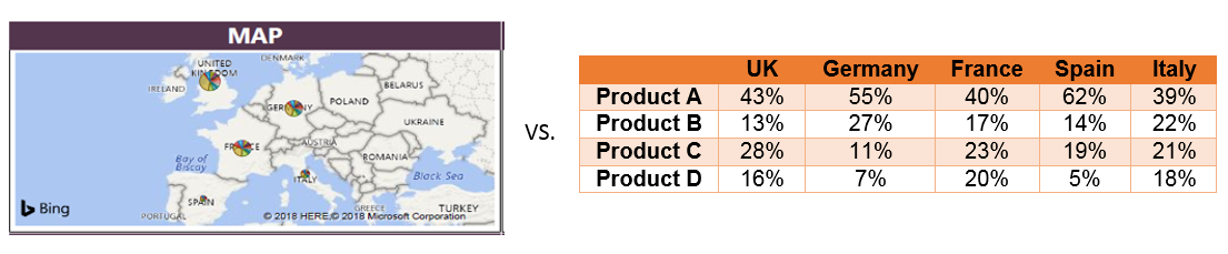
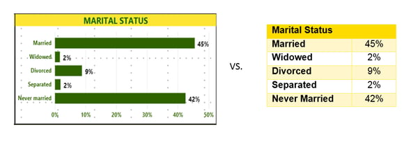
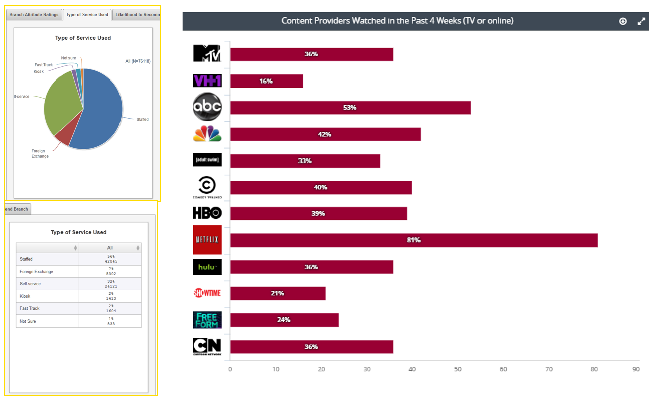
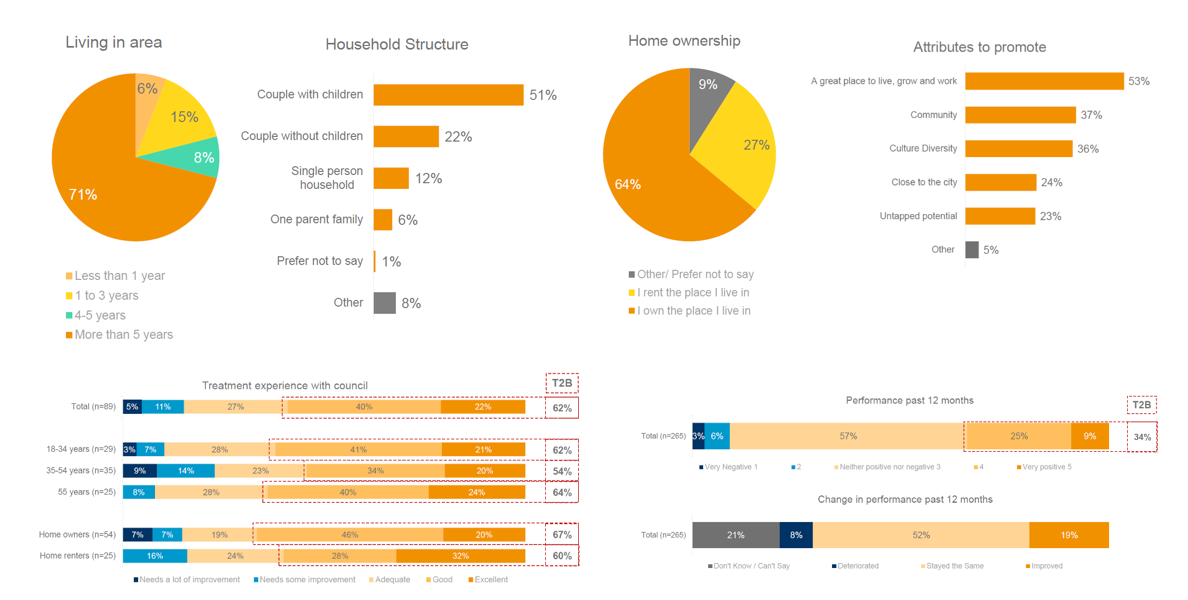
Visual aids are much more impactful than tables, as our brains will understand these much faster than trying to interpret raw data. Table formats can be too much information for us to register and interpret quickly. This is why custom dashboards can enable data story telling. Here are a couple more examples…
 But let’s take a step back. It’s important to keep in mind that when we refer to visual dashboards, we don’t simply mean pretty, colorful dashboards – the key is to represent meaningful data visually. So where do you start?
Do you need an end-to-end solution for building analytics with the ability to connect, shape, visualize, and share data insights quickly?
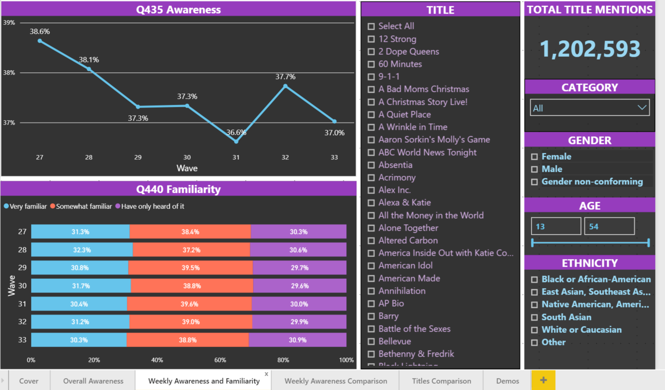
Are you looking to present appealing visuals of key survey metrics with instant, real-time access to data?
Will you require fast action with an analytic tool that allows you to interrogate, tabulate and chart survey results in real time via self-serve platform?
To guild your decision, as you go about the research framework (framing your research question and survey design, searching for existing answers, collecting and connecting data sets, activating research segments, and validating your sources), keep these questions in mind:
- Do I need an engaging way to present my data?
- Is an automated data feed required?
- Am I connecting third-party data sources in my reporting?
- Is cost a factor?
- Would I prefer a self-service option?
Whether you're looking for speed, connection or engagement – there’s a visualize option for you.
